ShopDreamUp AI ArtDreamUp

Deviation Actions


Description
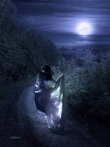
~EDIT~
I fixed up some of the shading/lighting (I'm still not very good with it but I'm getting there) and added some perspective into the background thanks to the lovely ~azusartcorner's critique which was super helpful (Smile)")
Very pleased with how this one turned out
Stock:


 [link] |
  [link] |
  [link] |
  [link] |
  [link]
the rest is painted by me
I fixed up some of the shading/lighting (I'm still not very good with it but I'm getting there) and added some perspective into the background thanks to the lovely ~azusartcorner's critique which was super helpful
Very pleased with how this one turned out
Stock:
[link] | [link] | [link] | [link] | [link]the rest is painted by me
Image size
1592x2388px 1.36 MB
Make
Canon
Model
Canon EOS 400D DIGITAL
Shutter Speed
1/200 second
Aperture
F/6.3
Focal Length
31 mm
ISO Speed
200
Date Taken
Jun 27, 2008, 4:08:40 PM
Sensor Size
9mm
© 2012 - 2024 nikkidoodlesx3
Comments25
Join the community to add your comment. Already a deviant? Log In
Very nice! I really like the mood of it.
However, the umbrella does look very flat... maybe it's because it used to be red, instead of a darker colour and was lit with a soft light source. The moon would cause a more contrasted shading with most of the umbrella in shadow, I think.
Like so [Link]
![Like so [Link]](https://www.deviantart.com/users/outgoing?http://up.picr.de/3354653.jpg)
It's no moonlight on that image, but also one single light source. See the harsh bright edges on the trees in the front? And where no light hits them, they are near black.
The buildings on the right side also seem to have an unnatural shading. I guess that's caused by those two dark streakes in front of the lady.
I also dislike how at the end of the buildings there seems to be no horizon. Sure, it's on the stock like that too, but it destroys the perspektive of the image. Some silhouettes of buildings should do the trick.
And please stay away from the font Papyrus. It's one of the most overused fonts out there, which has earned it a bad reputation. It immediately caught my eye. <img src="e.deviantart.net/emoticons/w/w…" width="15" height="15" alt="
I hope I could be of help, and you don't think the image is bad. As I said, I like the mood and at first glance it seemed to me more like a painting, than a photomanipulation. <img src="e.deviantart.net/emoticons/s/s…" width="15" height="15" alt="